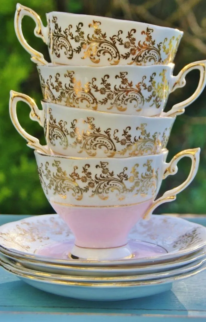
Somewhere in a flat in Bristol, a woman named Nell is holding a teacup up to the light. It is a 1930s art deco piece — pale sage green with a thin band of gilding and a pattern of stylised florals that sits somewhere between geometric and botanical. She is not thinking about tea. She is thinking about a coat.
"That exact green," she says, tilting the cup slightly. "Not mint, not olive — this green. The one that's slightly dusty, slightly warm. I've been hunting for it in fabric for two years."
Nell is part of a community that is hard to name precisely because it has grown so organically — a loose, joyful network of people across Britain who have discovered that their vintage crockery collections are, in fact, the most intimate and original colour references they own.
The Palette in the Cupboard
Britain has a particular relationship with chinaware that goes deeper than mere domesticity. The teacup is a cultural object, a vessel for ritual and memory and inheritance — and it turns out it is also, for a growing number of creatives, an extraordinary source of colour intelligence.
The colours in vintage china are not the colours of trend cycles. They are the colours of craft traditions, regional potteries, and decades of accumulated taste — Spode's particular shade of blue-grey, the warm cream of early Wedgwood, the vivid cobalt of Willow Pattern, the blush pinks of Royal Albert's more romantic ranges. These are hues with histories, and that history, it seems, is exactly what makes them so compelling as style references.
"Trend colours are designed to feel urgent and then disposable," says stylist and collector Fran, who runs occasional workshops pairing crockery collections with wardrobe building. "But the colours in a piece of 1940s bone china have already survived eighty years. They feel considered in a completely different way. They feel trustworthy."
From Tea Table to Dressing Table
The translation from cup to clothing is rarely literal — no one is wearing a dress printed with Willow Pattern (well, almost no one). What people are doing is something more nuanced: pulling the emotional quality of a piece of china and finding its equivalent in fabric, texture, and silhouette.
Collector and maker Bea, based in Edinburgh, describes her process as "listening to what the cup already knows." Her most treasured piece — a 1920s bone china cup in a faded dusty rose with tiny hand-painted violets — has inspired an entire corner of her wardrobe. "That cup knows about restraint," she says. "It's delicate but not fussy. It's romantic without being sentimental. Those are the qualities I try to bring into what I wear."
This kind of translation produces wardrobes that are genuinely distinctive. The colours tend toward the faded, the complex, and the slightly unexpected — the particular grey-lavender of lustre ware, the warm ivory of old Staffordshire, the deep teal of arts and crafts period pieces. Paired with the textures that feel right — heavy linens, worn velvets, brushed wools — the result has a coherence that no trend palette can quite replicate, because it is built from something personal.
The Inheritance Factor
For many in this community, the chinaware that shapes their style is not found in antique fairs (though there is plenty of that too) but inherited — passed down through families in boxes and tea chests and the backs of sideboards. This adds another layer to the creative process, because these are objects with specific emotional weight.
"My nan's tea set is cream with a thin gold rim and tiny blue cornflowers," says Jess, who runs a small natural dyeing practice in Shropshire. "Every time I look at it I think about her kitchen, her voice, the particular quality of Sunday afternoons in her house. I've been trying to capture that feeling in fabric for years. It's the most honest creative brief I've ever had."
Several natural dyers within the community have begun working directly with chinaware as a reference tool, developing dye recipes specifically aimed at matching the complex, aged tones of vintage pieces. The results — soft, slightly irregular, and rich with depth — are exactly the kinds of colours that look extraordinary in a wardrobe.
Pattern as Language
It is not only colour that translates. The patterns of vintage china — the florals, the geometric borders, the transfer-printed scenes — are also finding their way into makers' work. Embroiderers reference Imari designs. Textile printers rework toile patterns. Jewellers cast from the shapes of willow trees and pagodas that appear in classic blue-and-white ware.
"There's a whole visual vocabulary in British chinaware that hasn't been properly explored by fashion," says Fran. "It's not kitsch and it's not heritage in the boring sense — it's genuinely sophisticated pattern-making that happens to come packaged as something domestic. Once you start seeing it, you can't stop."
Beauty in the Ordinary
What the teacup-as-moodboard movement really celebrates is something very deeply British — the idea that beauty is not reserved for grand gestures or expensive objects, but lives in the everyday, in the inherited, in the ritual. The teacup on the kitchen shelf. The crockery set that has survived three house moves and two decades. The charity shop find that stopped you in your tracks.
These are the objects that, it turns out, know our colour stories better than any algorithm. They have been quietly waiting in our cupboards, doing their work, holding their hues.
All we had to do was look.