Read Between the Seams: The Book Lovers Dressing Themselves in Forgotten Libraries
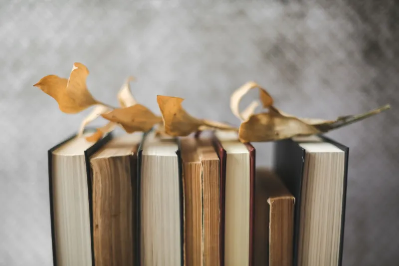
A Penguin paperback from 1962, its spine sun-faded to the most perfect dusty coral. A hardback clothbound in forest green with gilt lettering. A 1970s sci-fi novel whose cover art deploys a combination of electric teal and burnt amber that no contemporary designer would dare attempt. These are not just books. In the hands of Britain's most visually literate readers, they are references — jumping-off points for a way of dressing that is richer, stranger, and more personal than anything a trend report could prescribe.
The movement — if it can be called that — does not have a name or a manifesto. It lives in the margins of Instagram accounts dedicated to shelfies and secondhand finds, in the tote bags overflowing from weekend library sales, in the notebooks where certain people jot down colour combinations spotted on spines rather than catwalks.
The Library Sale as Mood Board
For Norwich-based illustrator and dedicated dresser Harriet Bloom, the Friends of the Library sale has replaced the fashion magazine as her primary source of inspiration. She attends every one she can find, and she is not primarily there for the reading material.
"I photograph the spines," she admits, without apology. "A shelf of Virago Modern Classics is one of the most perfectly curated colour palettes in existence — that specific shade of green, the white spine text, the way they sit together. I have worn that palette. I will wear it again."
Virago's iconic green is, in fact, a touchstone for many in this community. The publisher's decision in the 1970s to brand its feminist literature with a distinctive, unapologetic colour has made those spines a design reference point decades on — for book collectors, yes, but increasingly for people who simply respond to the visual confidence of the thing.
Typography as Textile
Beyond colour, it is typography that most captivates the literary dressers we spoke to. The lettering traditions of mid-century British publishing — hand-drawn display fonts, condensed sans-serifs, the particular elegance of certain Penguin cover designs — have begun appearing as direct references in fashion.
Several independent UK designers have started incorporating vintage typographic styles into their printed textiles. Leeds-based fabric designer Nell Partridge creates screen-printed cotton using letterforms sourced from her collection of 1950s and 60s book covers. Her fabrics are sold by the metre as well as made up into limited-run garments, and the demand, she says, has genuinely surprised her.
"People respond to the specificity of it," she explains. "It is not just 'retro lettering.' It is this lettering, from this book, from this particular moment in British design history. The story is part of the appeal."
The Clothbound Aesthetic
There is also a growing fascination with the physical materials of bookbinding as a style reference — and increasingly, as a direct source of inspiration for interiors and accessories.
The cloth-bound hardback, with its woven texture and restrained palette, has become a touchstone for a certain kind of quiet, considered aesthetic. Think linen in dusty sage, cotton in faded burgundy, textures that suggest age and care without tipping into shabbiness. Several UK interiors enthusiasts we spoke to described their homes as being decorated along "clothbound principles" — a commitment to material quality, muted colour, and the kind of beauty that deepens rather than diminishes with time.
For Edinburgh-based collector and interior stylist Magnus Reid, the connection between books and domestic space is intimate and literal. His flat is arranged around his collection of clothbound first editions, and the colours of those covers — forest greens, ochres, faded reds — have migrated directly onto his walls, his furniture, and his wardrobe.
"I own a tweed jacket that is almost exactly the colour of a particular Faber hardback from 1958," he says, pulling both from nearby shelves with evident pleasure. "I didn't plan that. But I'm not surprised."
Mining the Margins: Colour Stories from Forgotten Covers
Some of the most interesting visual material in the literary wardrobe comes not from the canonical publishers but from the forgotten paperbacks — the mid-century genre fiction, the pulp romances, the science fiction of the 1960s and 70s — whose cover artists were working with extraordinary freedom and absolutely no expectation of posterity.
These covers are riot: impossible colour combinations, hand-painted illustration, graphic boldness that contemporary design rarely matches. For those with the eyes to see them, they are an archive of chromatic courage.
Manchester-based fashion student Olu Adeyemi has been systematically photographing charity shop paperbacks for two years, building what she describes as "the world's most niche colour archive." The project began as a university research exercise and has become something more consuming. She now uses the archive as the primary colour reference for her own design work.
"There is a lime green and hot pink combination on a 1974 thriller cover that I have been trying to make work in fabric for eight months," she says, laughing. "It shouldn't work. It absolutely works."
The Narrative Wardrobe
What unites all of these approaches — the colour mining, the typographic references, the clothbound aesthetics — is a commitment to dressing as storytelling. The literary wardrobe is not assembled around trends or occasions. It is built around meaning, reference, and the particular pleasure of wearing something that has a sentence or two behind it.
This is, at its heart, a deeply Gorjuss instinct: the belief that the most interesting clothes are the ones that carry something beyond fabric and thread. A jacket the colour of a beloved Virago spine. A scarf in the palette of a forgotten paperback. A home in the quiet tones of a clothbound first edition.
Every outfit, a chapter. Every colour, a quotation. Every piece, a story waiting to be told to someone curious enough to ask.
The library sale opens at ten. Bring a tote bag. Bring a camera. And pay attention to the spines.